Alright, men! We’ve got a lot of work to do if we want a successful career in visual effects! I created this picture to not lose sight of the goal. My goal at SCAD and with visual effects- to work hard and create images for entertainment, and for profit! It’s a silly thing, but it organizes my blog page a little better.

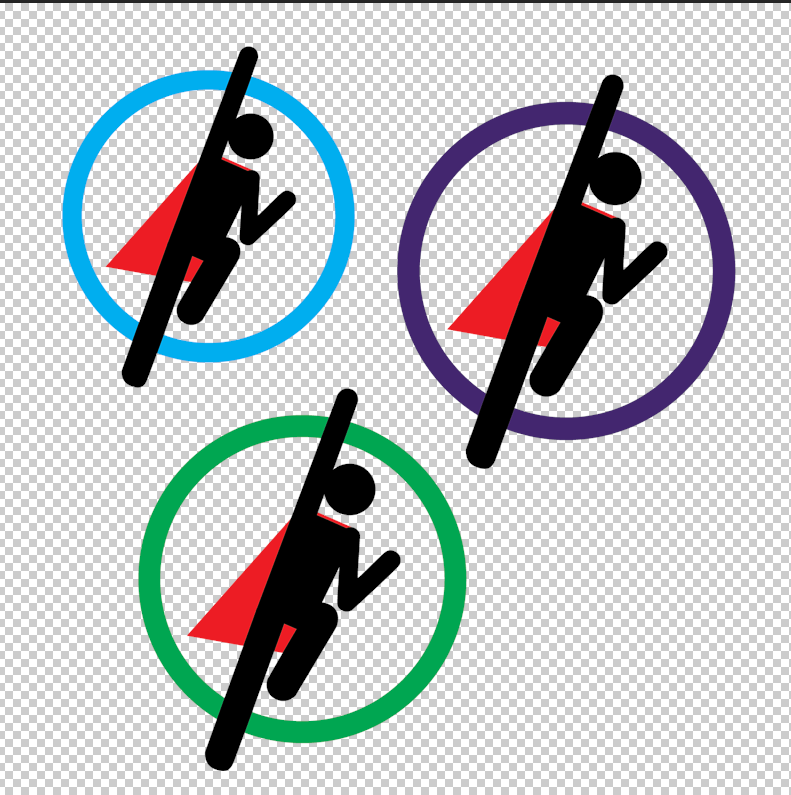
I’m continuing my brand development, starting with the furthering of my logo. I’m in the process of settling between three colors. I’m not totally settled on the blue. It makes sense with the “blue sky” narrative, though I think it doesn’t mesh perfectly with the red of the cape. Additionally, the baby blue seems a shade juvenile. I also went ahead and increased the length of the cape.
I decided to make it a ring instead of a solid circle, because the black-on-white of Fly Guy against paper is too striking of a contrast to let go.
I’m enjoying the green. While it’s not a traditionally heroic color, this hue makes a closer connection to the world of visual effects (green screen). The purple provides a closer link to my old website and color scheme. With a fun, fresh new website and color scheme, I’m letting go of the mysterious, magic technology feel of the old.
Week Three – The Joy of Job Sheets
This week it was my imperative to begin putting together my job sheet. Zeroing in on a position I would like to have in the future is a great motivator for my demo reel, website, and more.
Week Two – A Super New Personal Logo!


During weekend one leading into week two, I resolved to create a shiny new logo that I can use to unify my brand and my work! I went back to brush up, 2D-ify, and animate an old 3D illustration I made for my instagram portfolio – https://www.instagram.com/kradleyvfx/.

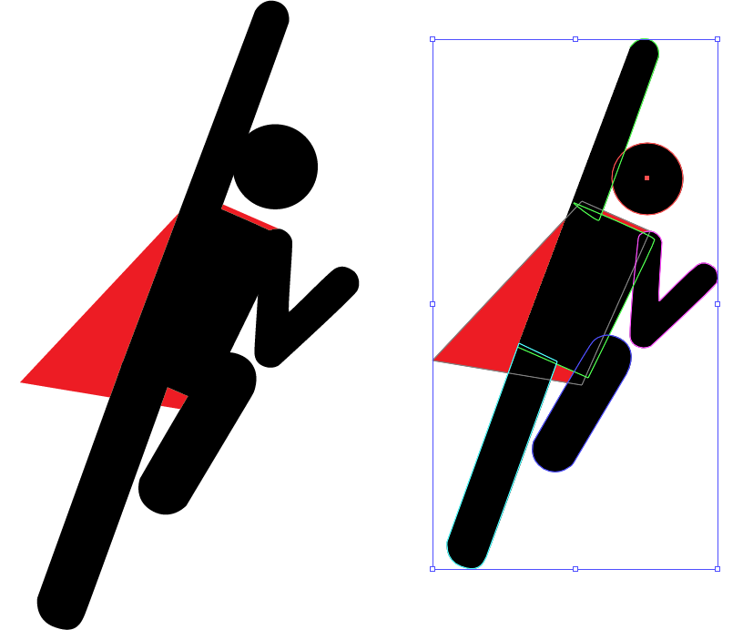
This is the 2D-ified version of my 3D logo I created in Adobe Illustrator. I’m pretty thrilled about this fun, dynamic logo, and I would be fine to have this (which I affectionately call Fly Guy) attached to my personal brand. The real trick, now, is to animate it. It seems like it would require some character animation, which I have little overall experience with. Professor Joe had a great suggestion, to add some gag where Fly Guy’s cape gets caught on something then rips. Then, the ripped remains of the cape can form my name. Adding a humorous gag would make me enjoy this logo even more .
However, there is another snag with this logo – the color red. In my original branding and website, I had a bright purple and dark gray as my main brand colors.
Week One – Brand New Website, kieranradley.com!
Throughout this post, I will chronicle my progress for the 10 week professional development class for VSFX, taught by Professor Joe Pasquale. This class is about the personal development of our professional portfolio, the “package,” as it were. This includes a polished demo reel, resume, animated personal logo, stationary, business card, and all the accoutrements that will lead us to present ourselves as a more valuable employee.
In the first week, I gave up my old website- kpradley.wixsite.com/home in favor of this new kieranradley.com! There are two reasons for this switch, first was I needed a cleaner domain that I can be proud about. With a name like kieranradley.com, I already felt a more personal connection and a deeper desire to make the site as good as it can be. Secondly, my previous free wix site ran out of storage (500 mb) due to the consistent uploading of videos and images throughout the past 2 years. This new website, created with WordPress, has either 50 or 100 gb of storage for me to utilize. If I wanted to upgrade my wix site to have more storage, it would cost about 3 times as much as this Hostinger site, with quite frankly less function.
So here we are! Kieranradley.com! I will continually update this website throughout this quarter, and past graduation. This is my site, welcome!